"LMS Microsite Redesign"
UX AUDIT • REDESIGN

Company Background:
HubLMS is a platform by Impulse Creative is the first CRM-powered LMS (learning management system) that is built 100% inside the HubSpot interface.
Problem Statement
The HubLMS website has lower than expected conversion rates. A UX audit must be performed to identify and resolve potential conflicts to the website's user journey.
BASIC UX AUDIT & REDESIGN
I examined the UX of the website to uncover design flaws that may be causing the low conversion rates. My redesign focuses on making the information necessary to facilitate the research stage of the buyer's journey, following visual best practice to encourage information hierarch, and ensuring that visual design and elements demonstrate the concepts that truly matter to users.
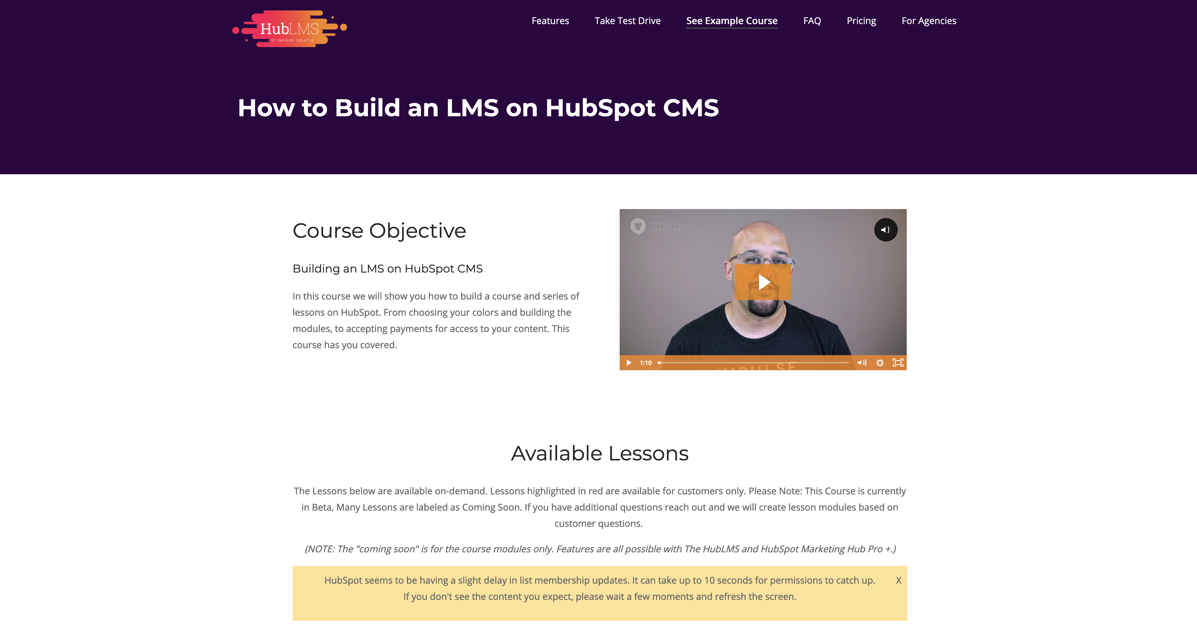
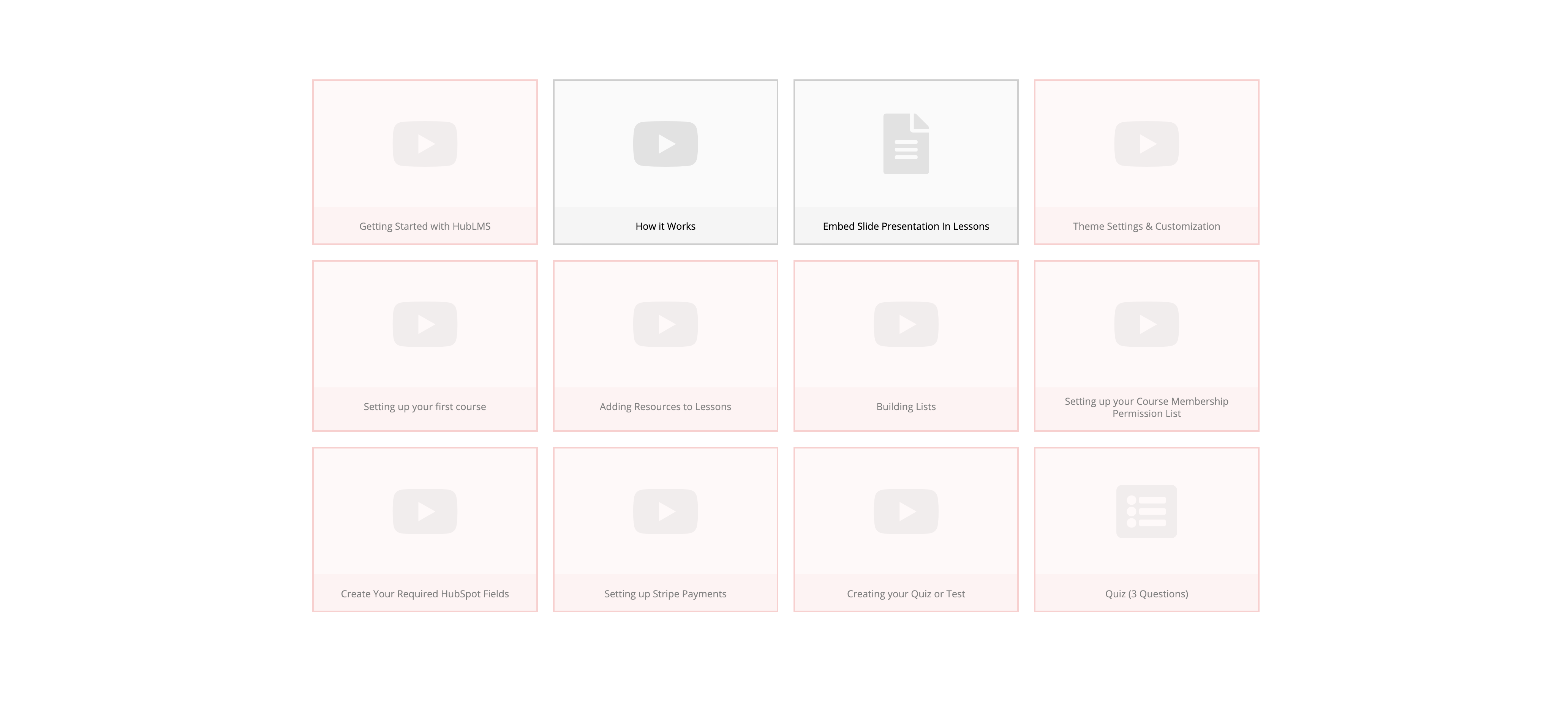
HubLMS Example Course Product Design
Before
- Page uses same template as remaining HubLMS website, making it unclear that the user has entered the product itself.
- Courses do not have any color/images
- Courses in red give the appearance of being broken, when they are actually just locked for this user.
- User's progress on the course is not indicated in any way.
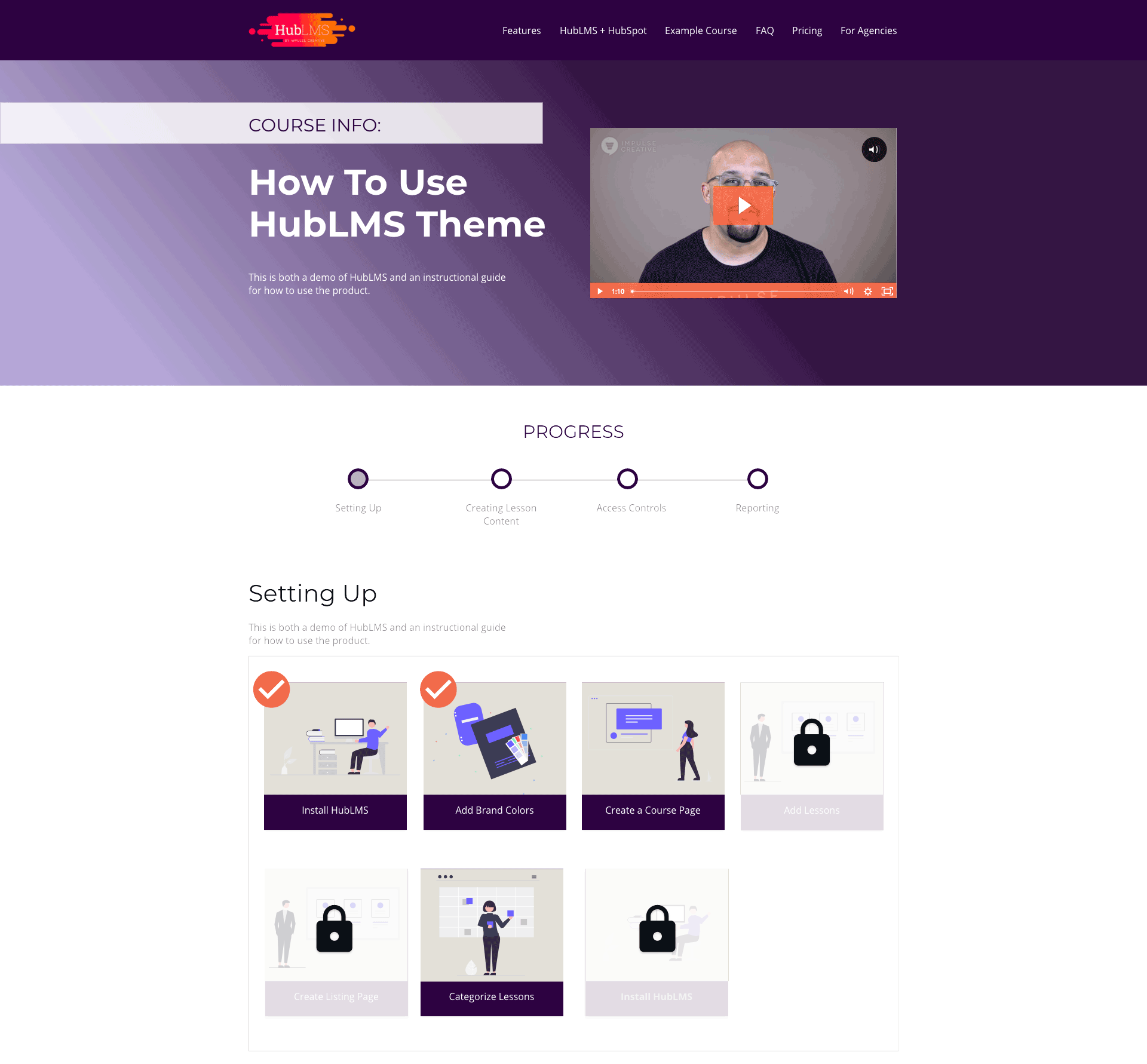
After
- Hero section style modified to creates a very different look/feel from remaining HubLMS website, while keeping brand colors.
- Added progress bar to indicate user's activity as well as checkmarks on lessons to show specific video completion.
- Added images for each course to add visual interest and demonstrate an important product feature.
- Changed red inactive boxes to grayed out boxes with locks, indicating that the content exists but is not available to this user.
Pricing Page
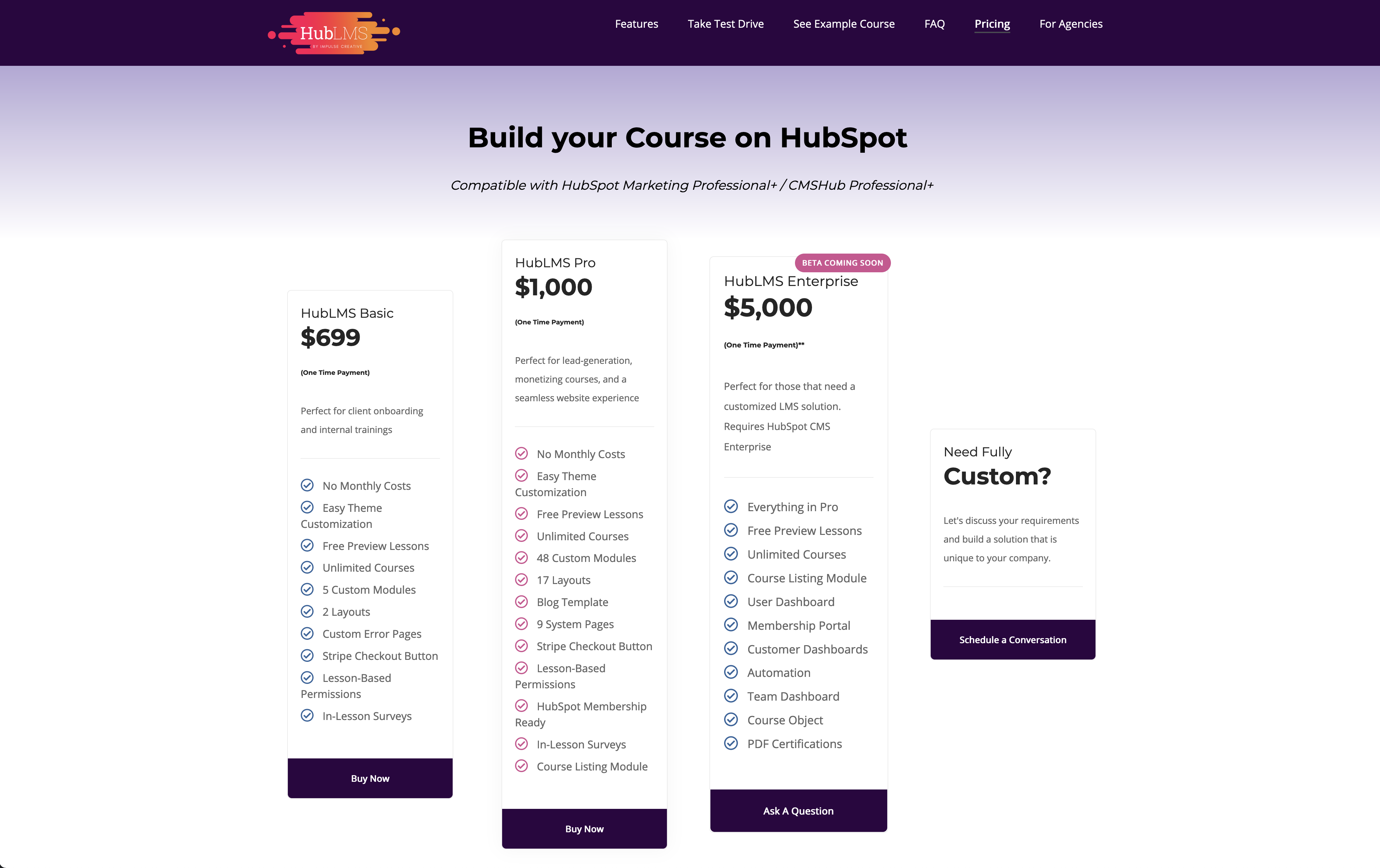
Before
- Uneven columns difficult to compare
- CTAs are not visible above the scroll and appear similar to a section footer.
- There are details in the pricing package that do not have context provided, such as "5 custom modules on the left vs "48 Custom modules" in the second. How does the user know what those are or how many they need?
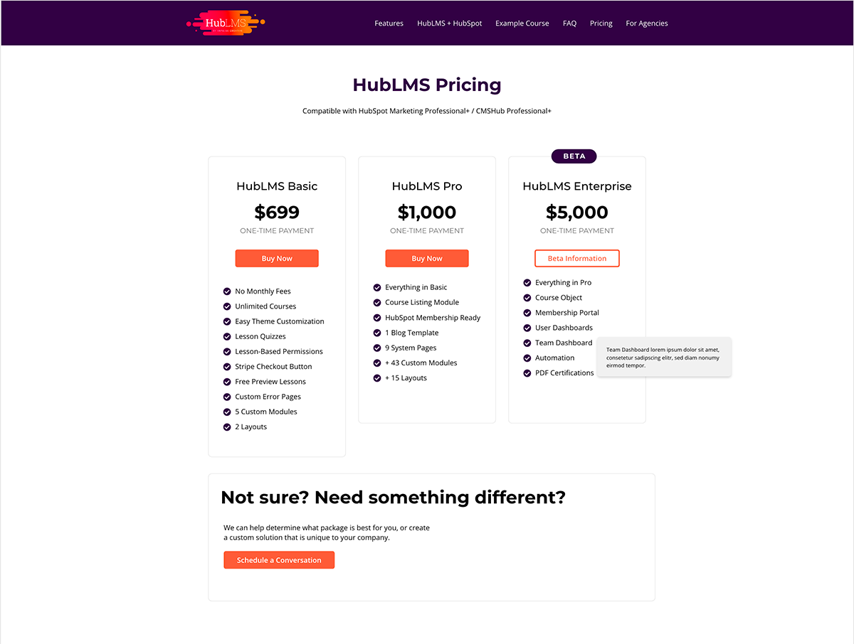
After
- Top-aligned columns to make them more scannable.
- Shortened redundant details to reduce column length.
- Changed CTA color/size and moved above scroll, as well as used a secondary CTA style for the column that didn't have a "buy now" option.
- Added tool tips to provide extra context for feature relevance/benefits
- Moved custom option to the bottom and merged it with new "not sure" copy to target both those who know and do not know if they need a custom build.
Feature Photos
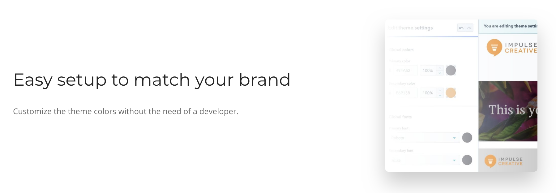
Before
- Shows HubSpot CMS interface -- unrecognizable to anyone unfamilar with product
- Does not indicate how much can be customized
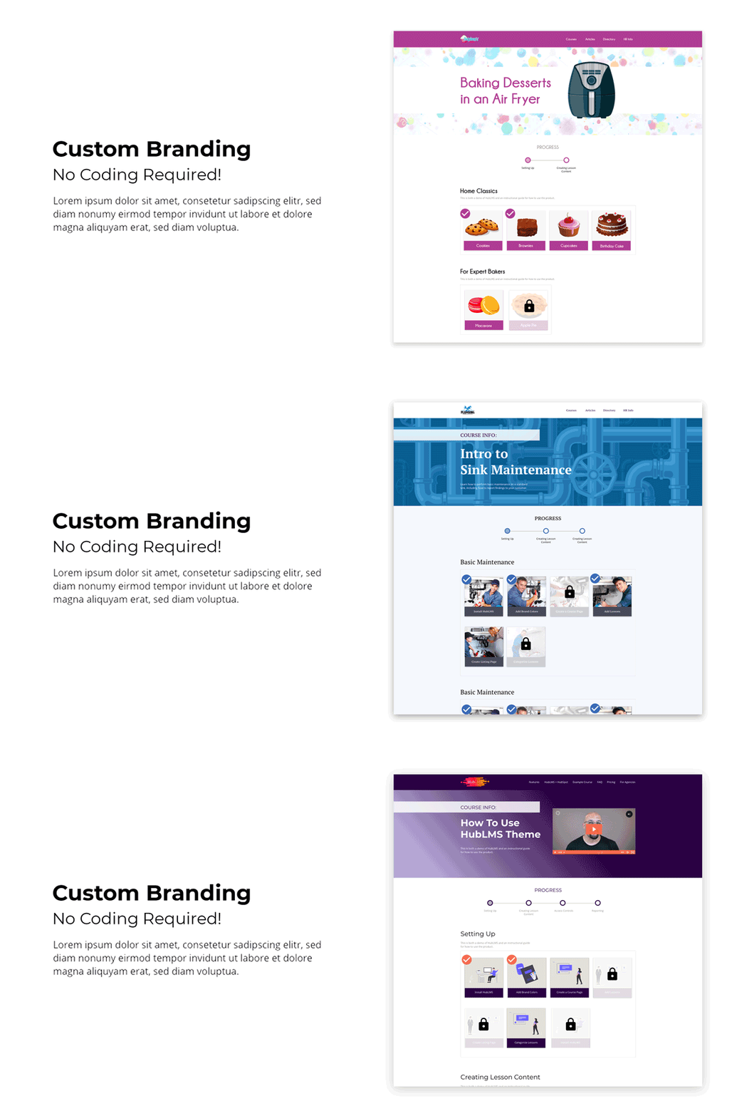
After
- Visually demonstrates end result benefit (ability to visually brand the HubLMS product in a variety of styles) rather than highlighting the interface
HubSpot/HubLMS "Integration" Page
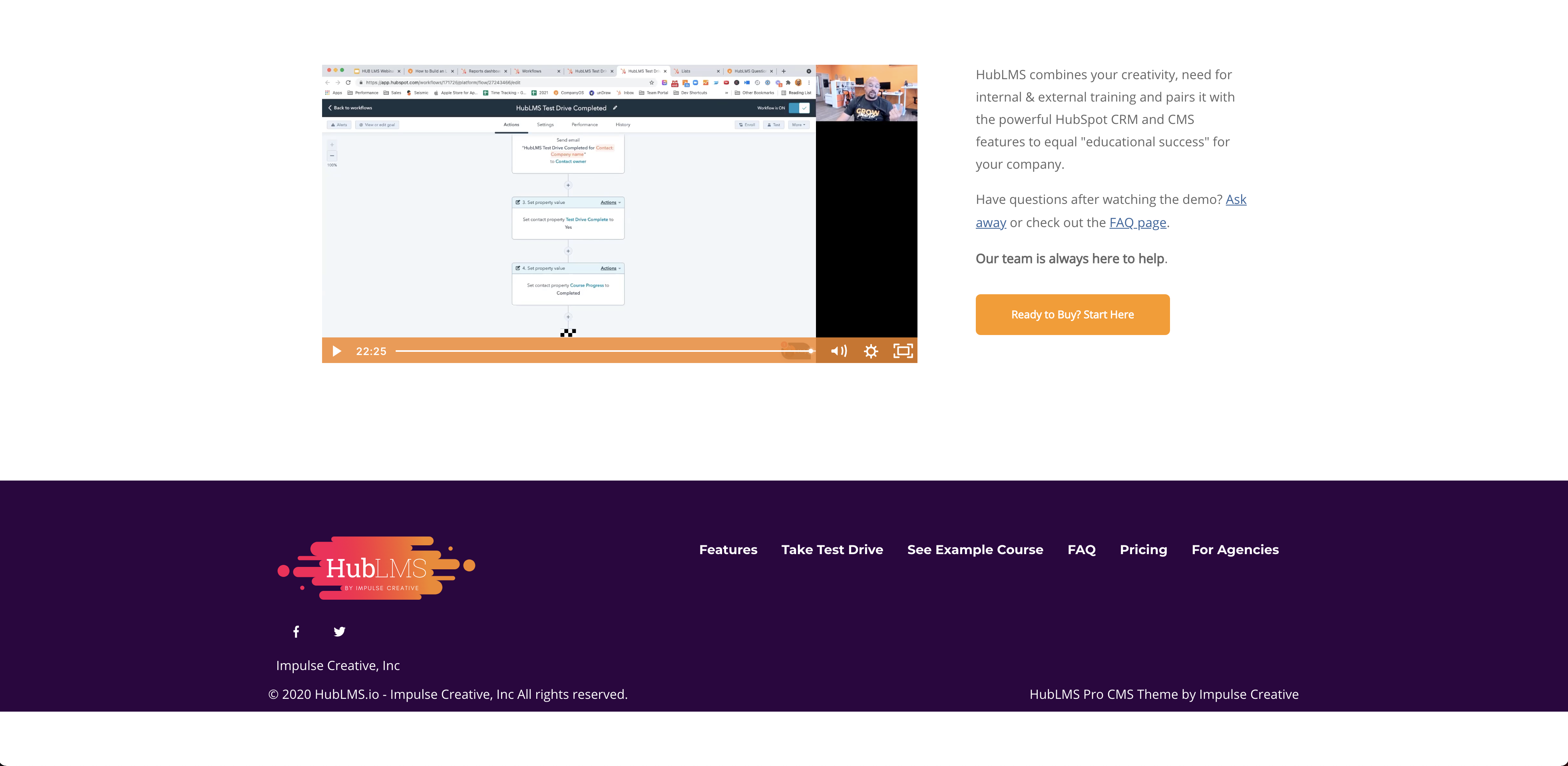
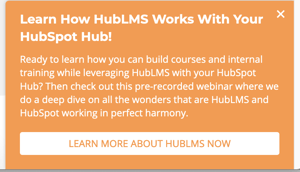
Before
- Page is only accessible via a pop-up that can be exited and cannot be restored.
- Has no on-page information for users that are hearing impaired or prefer to learn via reading rather than video.
- Video content does not highlight compatible HubSpot features/use-cases.
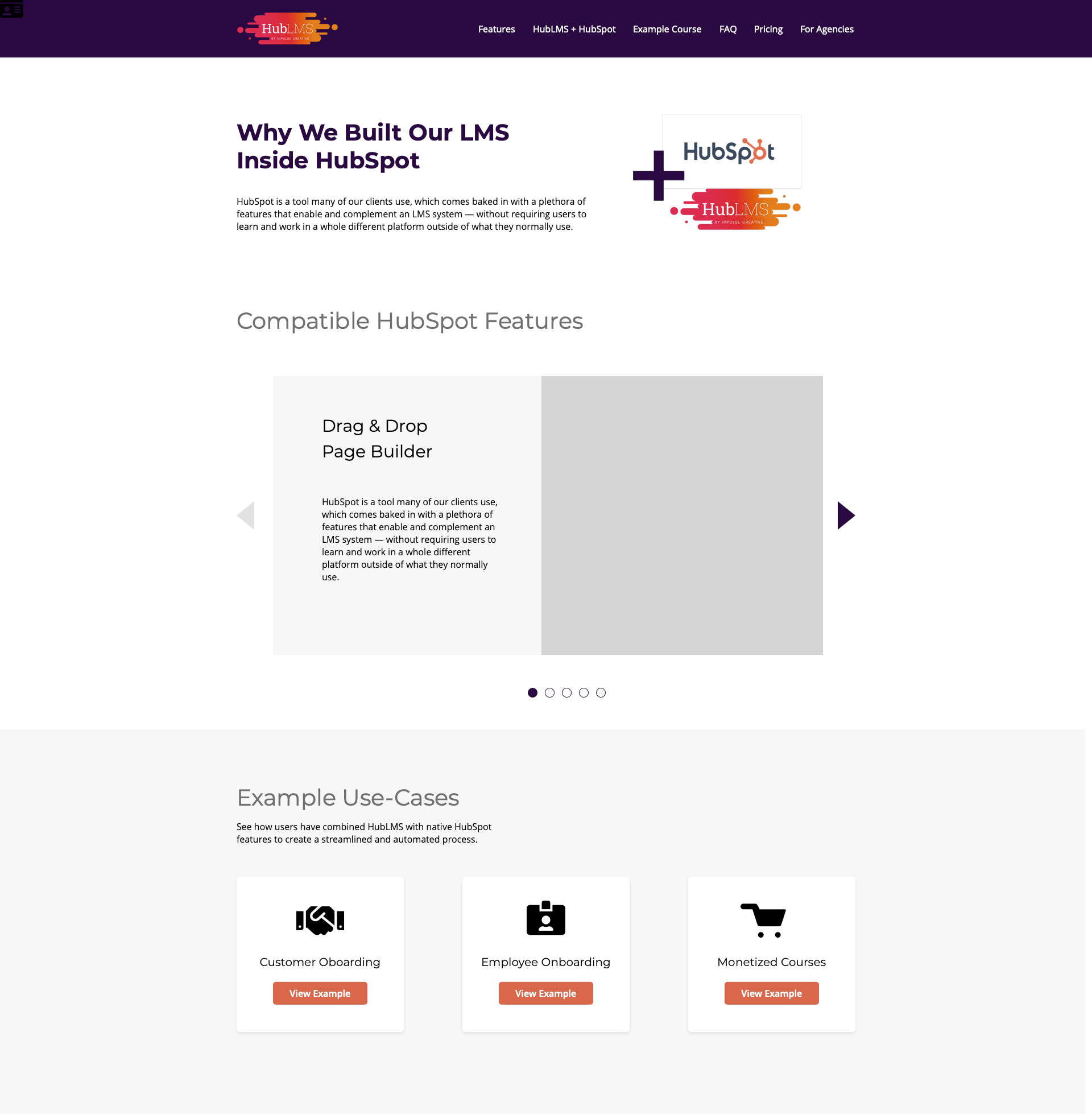
After
- Page added to main navigation
- Introductory text taken from video into page copy.
- Copy and visuals for compatible HubSpot features added.
- Added example use-cases for HubSpot flows that HubLMS can enhance.