"Registration Frustration"
DATA ANALYSIS • UX AUDIT • REDESIGN
Company Background:
Classroom Training is a paid service offered by HubSpot that provides live trainings to users in a digital, instructor-led, interactive environment. Training events are held in different time zones and languages to promote accessibility across HubSpot's global customer base.
Problem Statement
A high volume of users were submitting support tickets while registering for events via HubSpot's Classroom Training website. The issues were related to human error, so an evaluation and redesign was necessary to improve user experience.
ANALYSIS
To enable the UX Audit, I first performed a trend analysis of historic support records to identify themes within the reported issues. I identified 3 recurring issues, which I later compared against my audit findings to create specific goals for the redesign.
User Quotes
-
“...signed up accidentally for the English training ..."
-
“... accidentally booked a training in Central European Time ..."
-
"...didn't see the Marketing Hub training for next week..."
TOP TRENDING ISSUES
# 1
Booked the wrong time zone.
# 2
Booked the wrong language.
# 3
Could not find the advertised training.
UX AUDIT
Based on the problems uncovered in the research phase, I examined the UX of the website to uncover design flaws that may be causing these issues. I focused on the Listing Page, which shows the dates of upcoming trainings, and the Registration Page, which features a form for users to submit to sign up for their training.
Listings Page
AUDIT FINDINGS
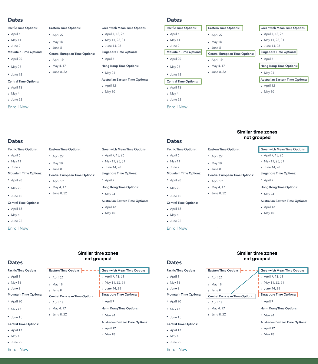
Dates Segmented by Time Zone
Grouping dates by each specific time zones does not make sense. Most users would rather start a training 1-2 hours earlier/later than wait 2+ weeks for their exact time zone.
A user in Greenwich Mean Time may want to compare other reasonable options; however, GMT is next to Eastern Time (+4 hours) and above Singapore time (+8 hours), neither of which is practical. The best option, Central European Time, is located diagonal from GMT. This is not intuitive.
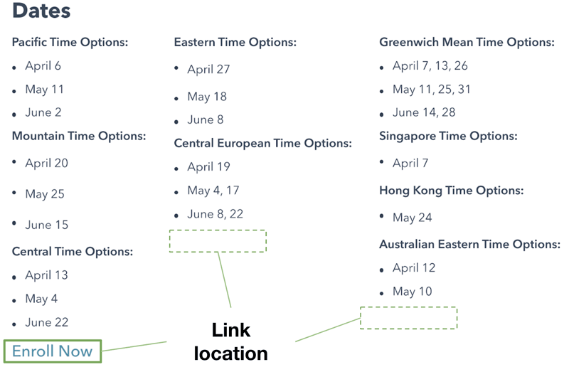
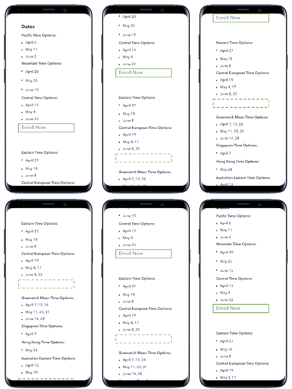
CTA Link Location
The link to "Enroll Now" is inconveniently placed, and may falsely imply that certain options are unavailable. This is especially poor in mobile there there is no visible link at all once you scroll past the first group of time zones.
Registration Page
AUDIT FINDINGS
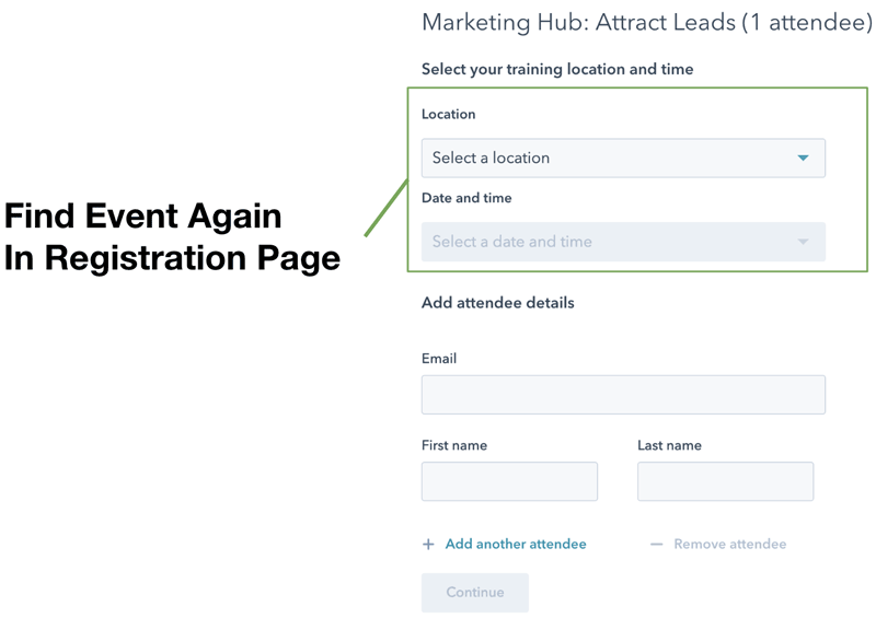
Find Training Date.... Again
We know that most users look through the date options on the previous page, and click "enroll" after the find an option that works for them. Therefore, it is superfluous to have the user go through the process of searching for a training again on this dropdown form.
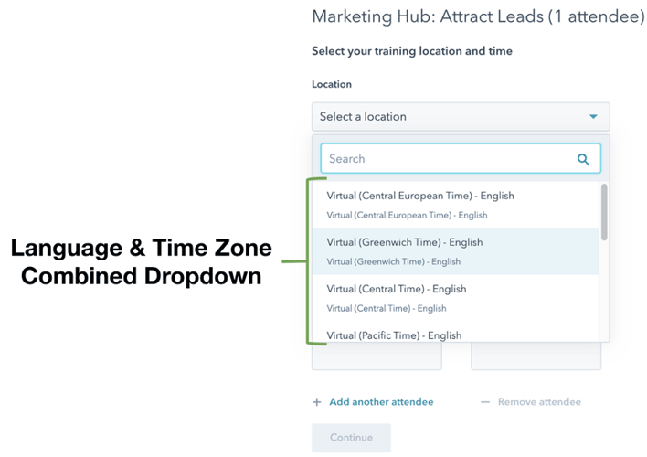
Combined Time Zone & Language
All time zones are listed in a single dropdown, and not alphabetically. Similar names like "Central Time" and "Central European Time" can easily be confused.
The language is tacked on at the end of each zone name, which is easy to overlook. In addition, there is no expectation set by the listing page or within the form labels/help text that users must choose a language.
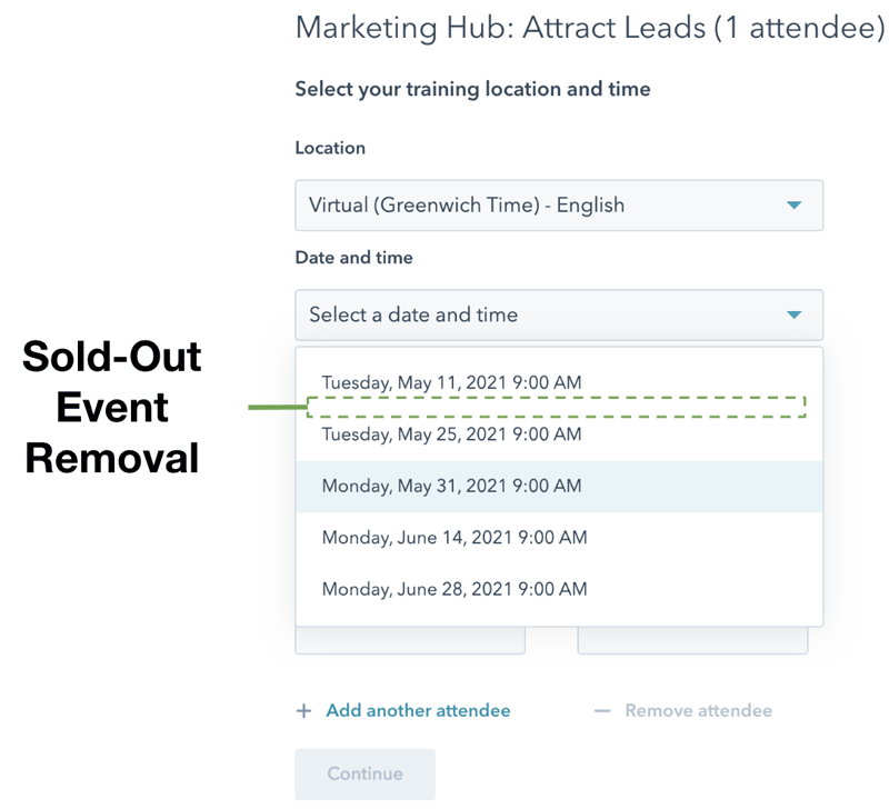
Sold-Out Events
Sold-Out Events are removed from the options on the registration form. With no explanation given as to why dates advertised via email or on the listing page are not appearing, users assume a glitch or human error is responsible.
Problem/Design
CORRELATION SUMMARY
Users select the wrong time zone
- Users must search again for their training on the registration page
- All time zone options are displayed, regardless of prior activity
- No ability to narrow time zone option by region
- Time zone dropdown options are not in alphabetical order
- Training date organization is not visually aligned with realistic customer priorities. ( time zone is more flexible than date)
Users select the wrong language
- Listing page does not reference language
- Users must search again for their training on the registration page
- Time zone and language selection are combined, increasing likelihood of selection error
Users can't find the training they want
- Users must remember and select the correct time zone / language in order to see correct dates
- Events are completely removed from date list when sold out
- No indication that training may sell out soon
- Enroll button on listing page is inconveniently placed, and may falsely imply that certain options are unavailable
- Customers with flexible schedules and/or who are multilingual cannot conveniently assess options
REDESIGN
Using the findings from the UX Audit as a guide, I developed 3 clear goals for a potential redesign. Based on these goals, I created 2 variations, each including a listing page & registration page.
Goal #1
Users can focus on training options offered at a reasonable time of day.
- Group dates by region or relevant time range
- Limit selectable options based on desired region/time range
Goal #2
Users can view training options based on their preferred language(s).
- Separate language from time zone selection
- Include language information on listing page
- Allow for multi-select of languages
Goal #3
Users understand when and why a training is no longer available
- Indicate when trainings are sold out
- Make sold-out trainings unselectable
VERSION A
[ MAINTAIN EXISTING FORMAT ]
Listings Page
FEATURE HIGHLIGHTS
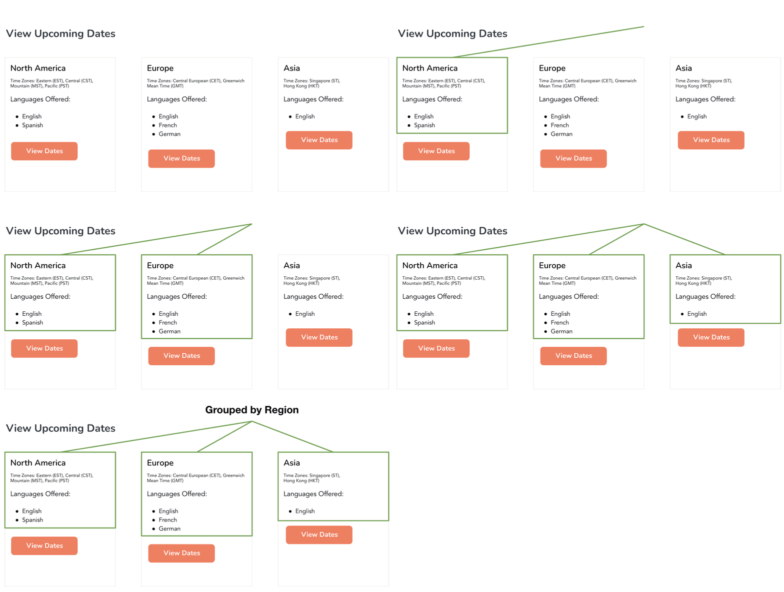
Group By Region
Instead of listing out each individual date and time zone, the listing page just includes groupings of regions, with details on the time zones and languages included within each region.
Dates are no longer listed on this page, so users only go through the date selection process on the registration page.
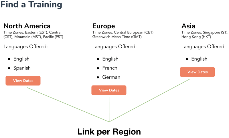

Link By Region
Each region has its own CTA button, making it clear and easy to find on both desktop and mobile.
Registration Page
FEATURE HIGHLIGHTS
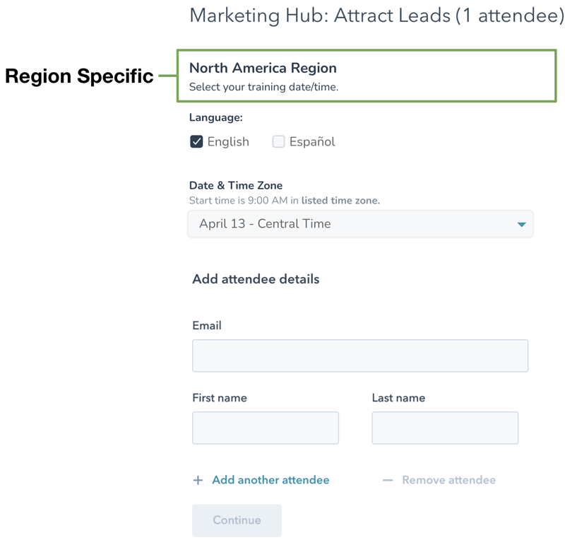
Region-Specific Options
Each region has its own registration page, which limits the language and date/time options the user sees to only options relevant to that region.
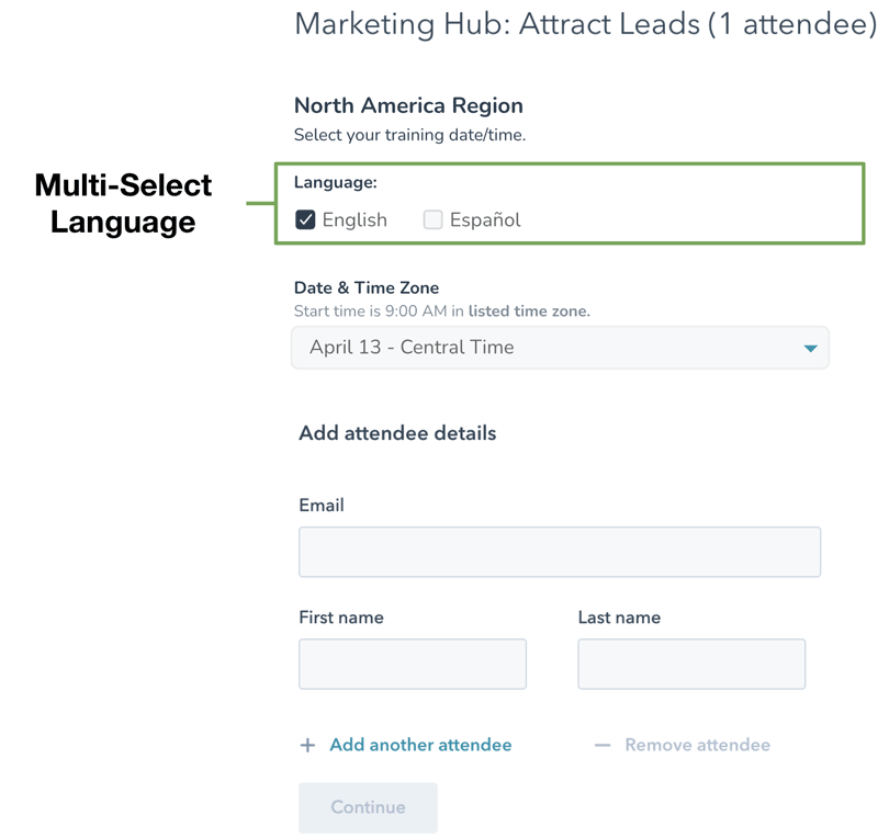
Multi-Select Language
Users can further refine by selecting the language(s) they are interested in. English is selected by default, and at least one language is required. The selected language(s) will determine the dates & time zones that appear in the next dropdown.
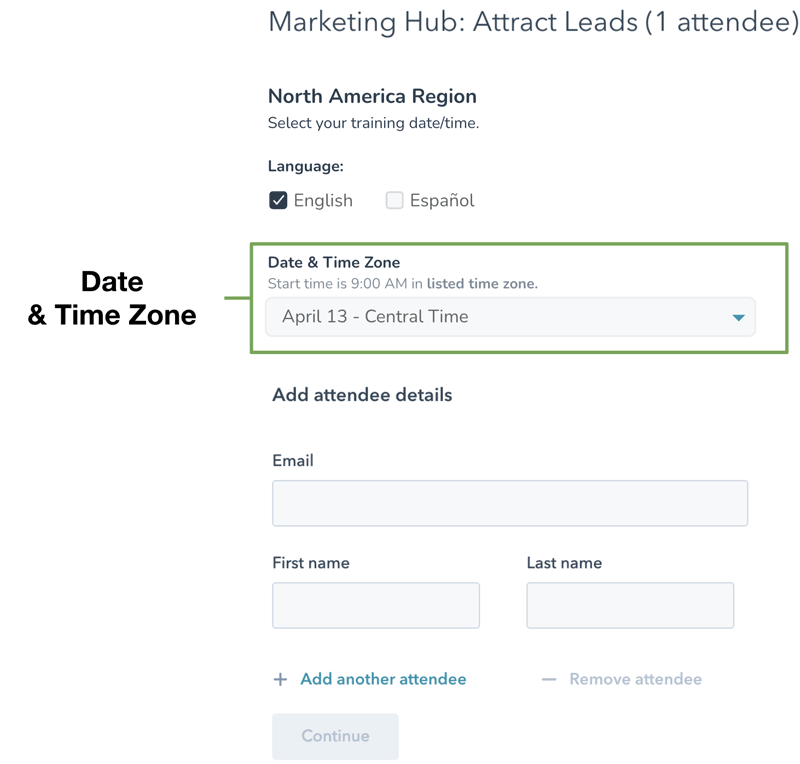
Date & Time Zone
Options are ordered chronologically by date, with overlap listed alphabetically by language. Helper text above the dropdown indicates that the start time is based on the selected time zone. Because options are limited to region, the range for potential time zones will only vary by 1-3 hours.
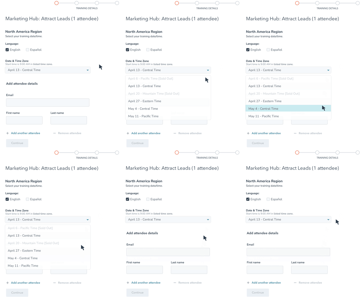
Sold-Out Events
When sold out, trainings are no longer removed from the options on the registration page. Instead, they are grayed out, disabled, and appended with a "[Sold Out]" tag.
This will help users understand why they cannot select the training they previously were interested in, and allow them to instead review and select from the options currently available.
VERSION B
[ OVERHALL EXISTING FORMAT ]
Listings Page
FEATURE HIGHLIGHTS
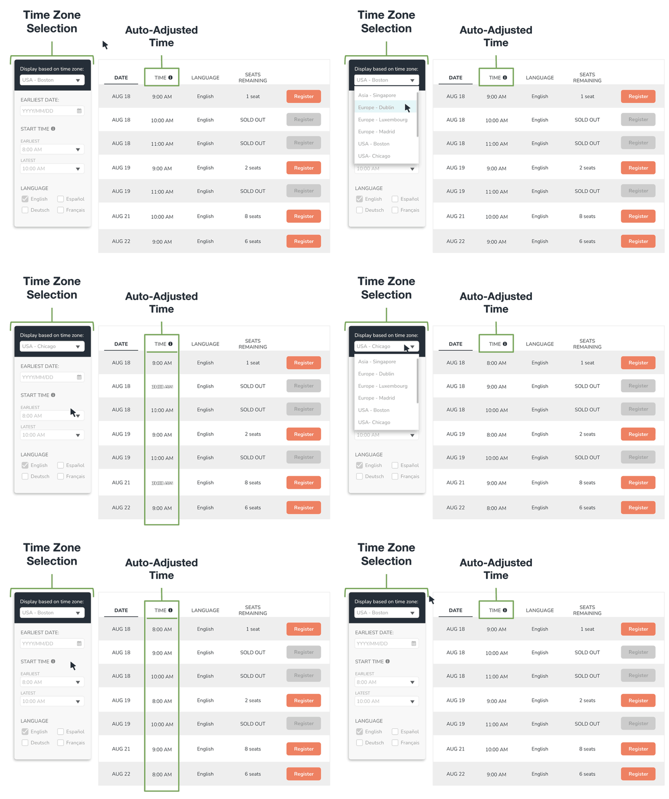
Auto-Adjusted Start Time
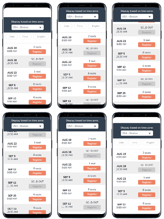
The listing page displays the start time of each training in relation to the user's time zone. This is automatically set based on the user's IP region, but can also be manually overridden if users are booking trainings for team members in different time zones or otherwise need to adjust.
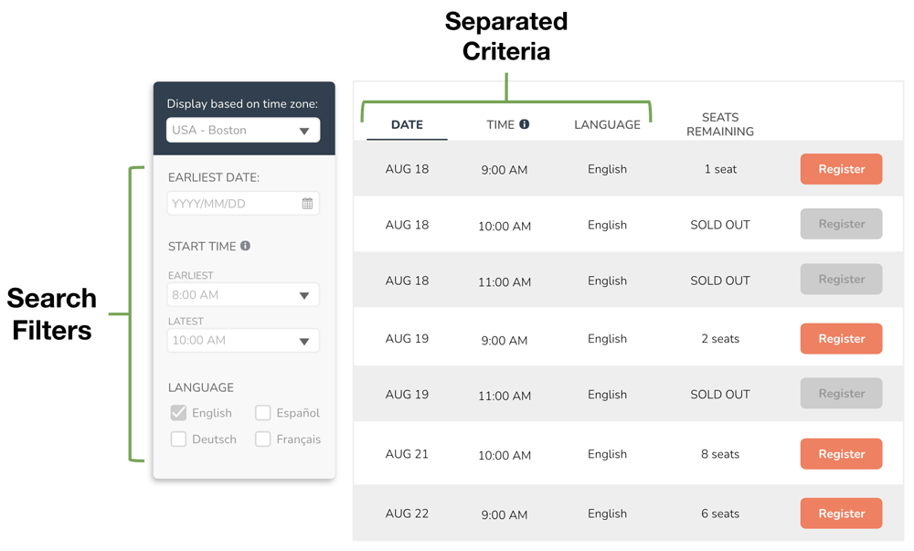
Interactive Listings
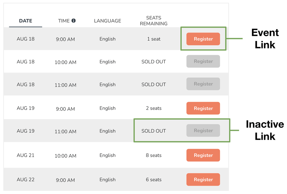
Users can see upcoming training events directly on the listing page, with date, time, and language each independently displayed. They can use a search bar to filter the events and focus only on relevant options.
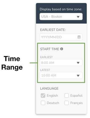
Time Range Filter
Thanks to the auto-adjusted time display, users don't have to select specific time zones and try to calculate in their head whether each one fits their schedule. Instead, they can select a range for the earliest-latest start time they are comfortable. This setting defaults between 8am-10am, which is +/- 1 hour from the standard 9am start time.
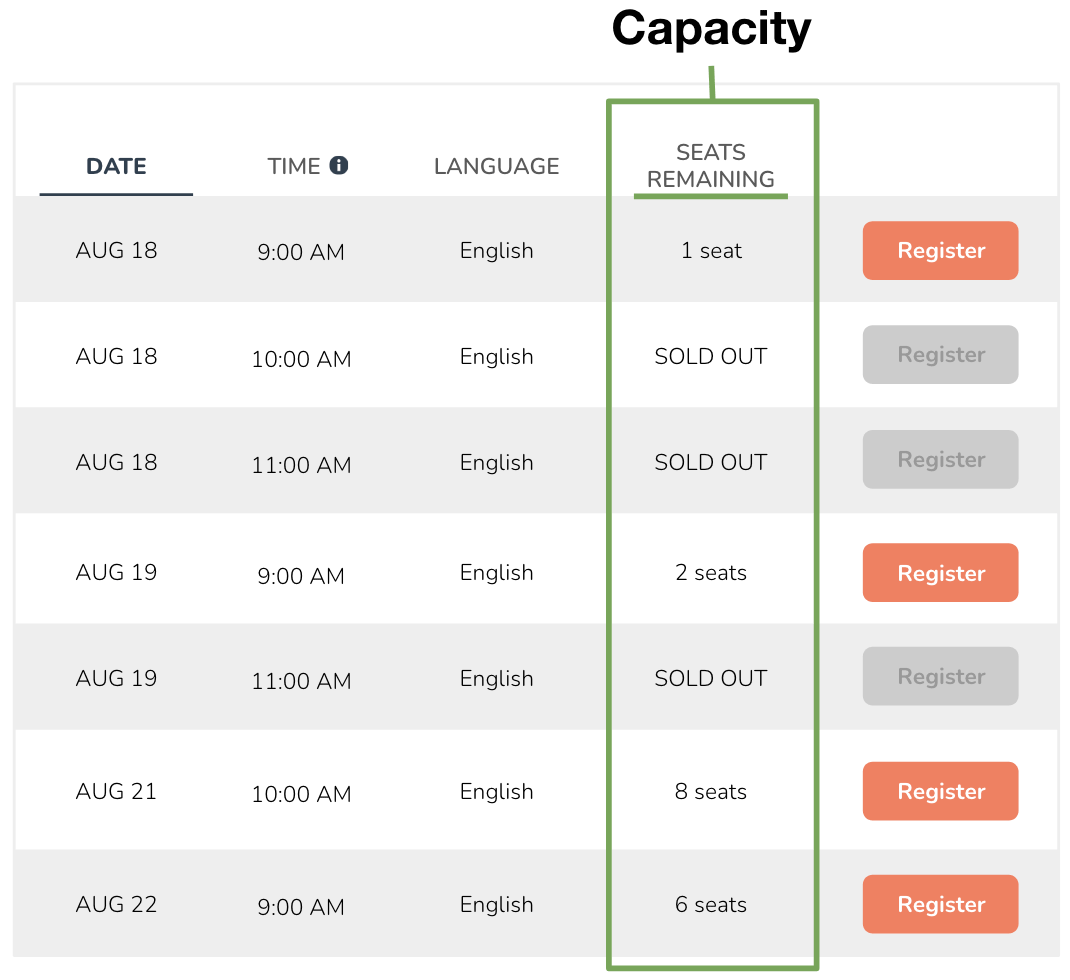
Remaining Capacity
The "Seats Remaining" column will help users anticipate if an event may sell out soon, as well as help identify trainings with enough room for multiple team members to attend together.
Links & Sold-Out Events
Each event has its own high-contrast CTA button that links to an event-specific landing page. Similar to the registration page of Redesign A, the links for sold-out trainings remain visible but are deactivated and labeled appropriately to help users redirect to another option.
Registration Page
FEATURE HIGHLIGHTS
Event Details
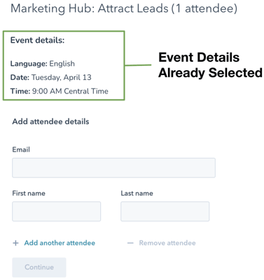
The registration page is specific to the event that was clicked on, which means it already has the event details selected. The user only needs to visually confirm the training info and fill out attendee details.